Double Dices
System Design
Research
Our starting point was simple: “compressing information.” After all, the original problem was mapping out 36 characters (the alphabet plus 0–9).
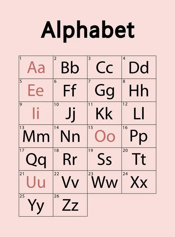
+ 0123456789
My initial thought was to shrink this set, compress the 36 characters down to 26, or something along those lines. From there, we started looking outward for inspiration.
1. Some Interesting Examaples
2. Disemvoweling
It used to be a common feature of SMS language where space was costly.
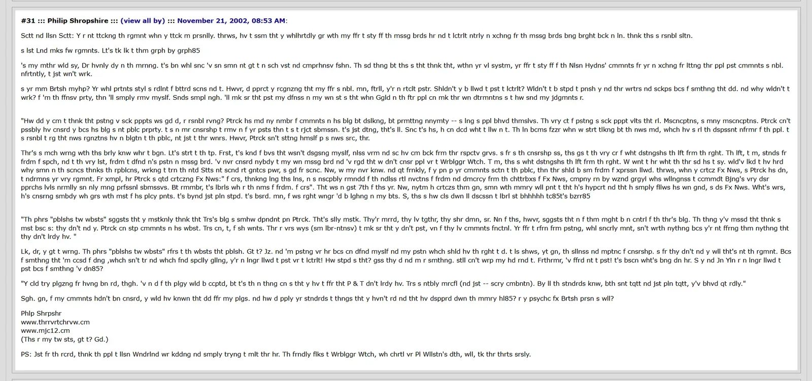

There’s your man for narrative compression.
Speaking of which, I decided that since nobody was paying attention to PS’s arguments anyway, and it’s dreary having to scroll up and down past them, they’d be better shortened.
So I took out the vowels.
The result is surprisingly legible. Cutting out 5 characters at a time sounds ideal, at least in theory.
2. 1337 (Leet)
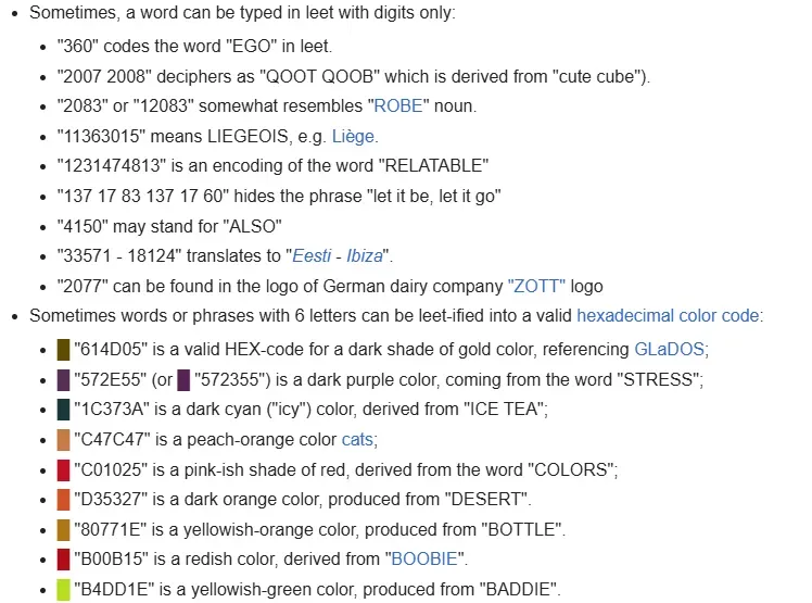
Leetspeak is another form of “information compression” that I really enjoy, even though, strictly speaking, it doesn’t always compress anything, and sometimes just makes things more confusing. But if we focus only on the “typed with digits only” angle (using numbers as direct replacements for letters) I think it can actually be an effective method.
While researching, I also came across a color-based variant of leetspeak, which honestly looks super cool.
3. Geometric Fonts
Geometric sans-serif typefaces are based on geometric shapes, like near-perfect circles and squares. Common features are a nearly-circular capital ‘O’, sharp and pointed uppercase ‘N’ vertices, and a “single-storey” lowercase letter ‘a’.
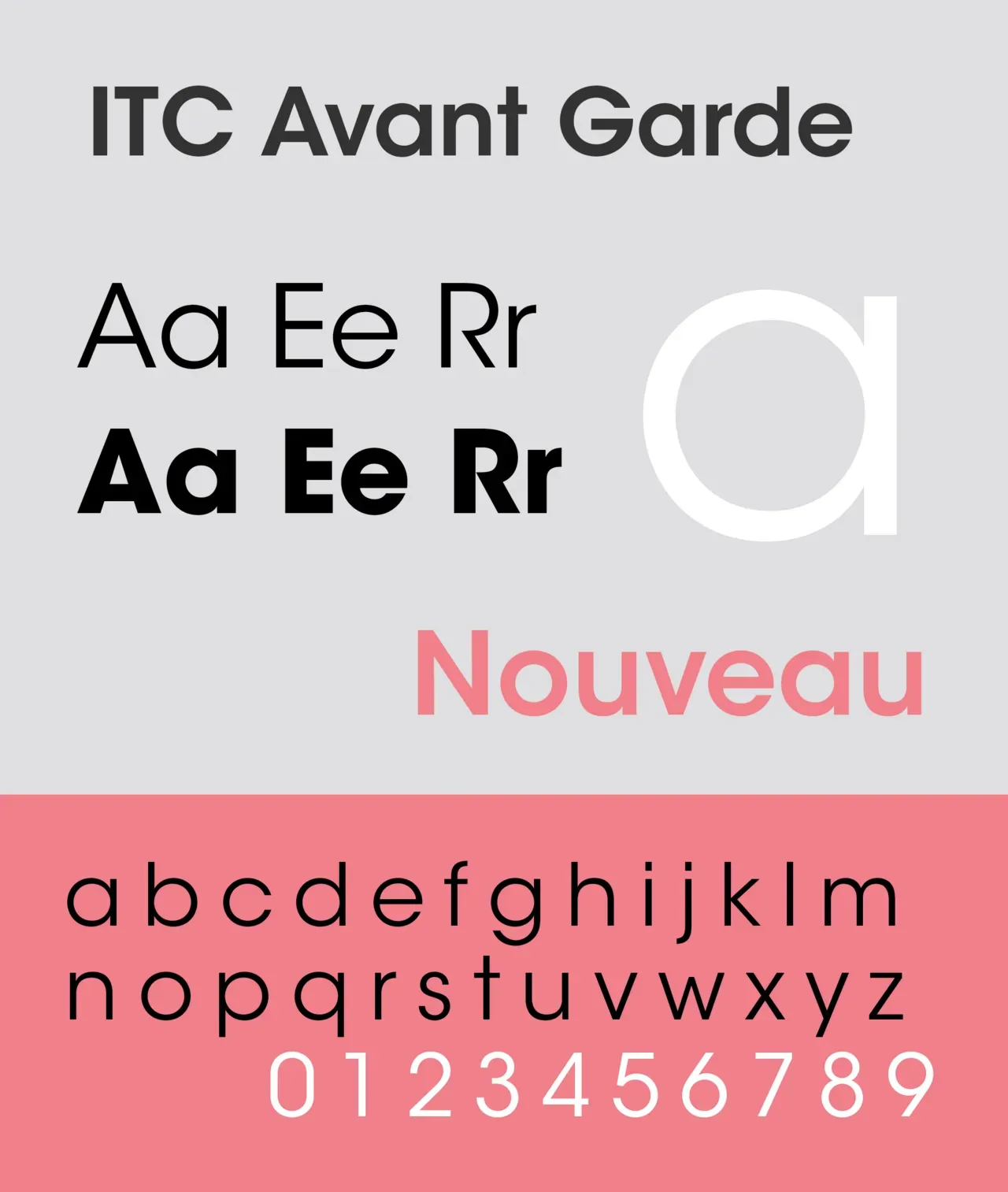
We also started wondering if letters could be represented with simple geometric shapes. It felt like this might be another efficient path. In that case, all we’d need would be cut-outs of triangles, circles, squares, etc., and then use the shapes themselves to carry the message.
First Attempt
Our first approach went like this: strip out the vowels, convert numbers into letters, and then group everything into geometric categories.
| Consonant | Capital Case | Number | Geo-group |
|---|---|---|---|
| b | B | 8 | circle |
| c | C | 3 | semi-circle |
| d | D | 0 | semi-circle |
| f | F | 9 | line |
| g | G | 6 | circle |
| h | H | 4 | line |
| j | J | triangle | |
| k | K | triangle | |
| l | L | 1 | line |
| m | M | triangle | |
| n | N | triangle | |
| p | P | semi-circle | |
| q | Q | circle | |
| r | R | semi-circle | |
| s | S | 5 | semi-circle |
| t | T | 7 | triangle |
| v | V | triangle | |
| w | W | triangle | |
| x | X | triangle | |
| y | Y | triangle | |
| z | Z | 2 | triangle |
Group 1 (Circles)
- B (8)
- G (6)
- Q
Group 2 (Semi-Circle)
- C (3)
- D (0)
- P
- R
- S
Group 3 (Line)
- F (9)
- H
- L
Group 4 (Triangle)
- J
- K
- M
- N
- T
- V
- W
- X
- Y
First Attempt Testing
I have to admit, I realized that stripping out all the vowels doesn’t actually make communication faster.
For example, “TH QCK BRWN FX JMPS VR TH LZY DG” (The quick brown fox jumps over the lazy dog) still kind of works, because it’s familiar. But with more complex sentences, or anything without shared context, it quickly turns into a disaster.
So we concluded that if we want to keep accuracy high, we have to let go of those fancy tricks of compressing information by cutting down characters. Efficiency without clarity just isn’t worth it.
Second Attempt: Cotinuing with the “Grouping” Idea, but Differently
We switched our views and decided to take a more physical approach: we first need to decide what physical medius to use, then develop the visual communication language from there. So what are some things immediately recognizable in the physical space that could be controlled to communicate concise, real-time information?
At the very beginning, we thought about making use of something already on the floor: chairs. We sketched out a diagram to explore possible chair arrangements and imagined them working as an “octal” symbol system:
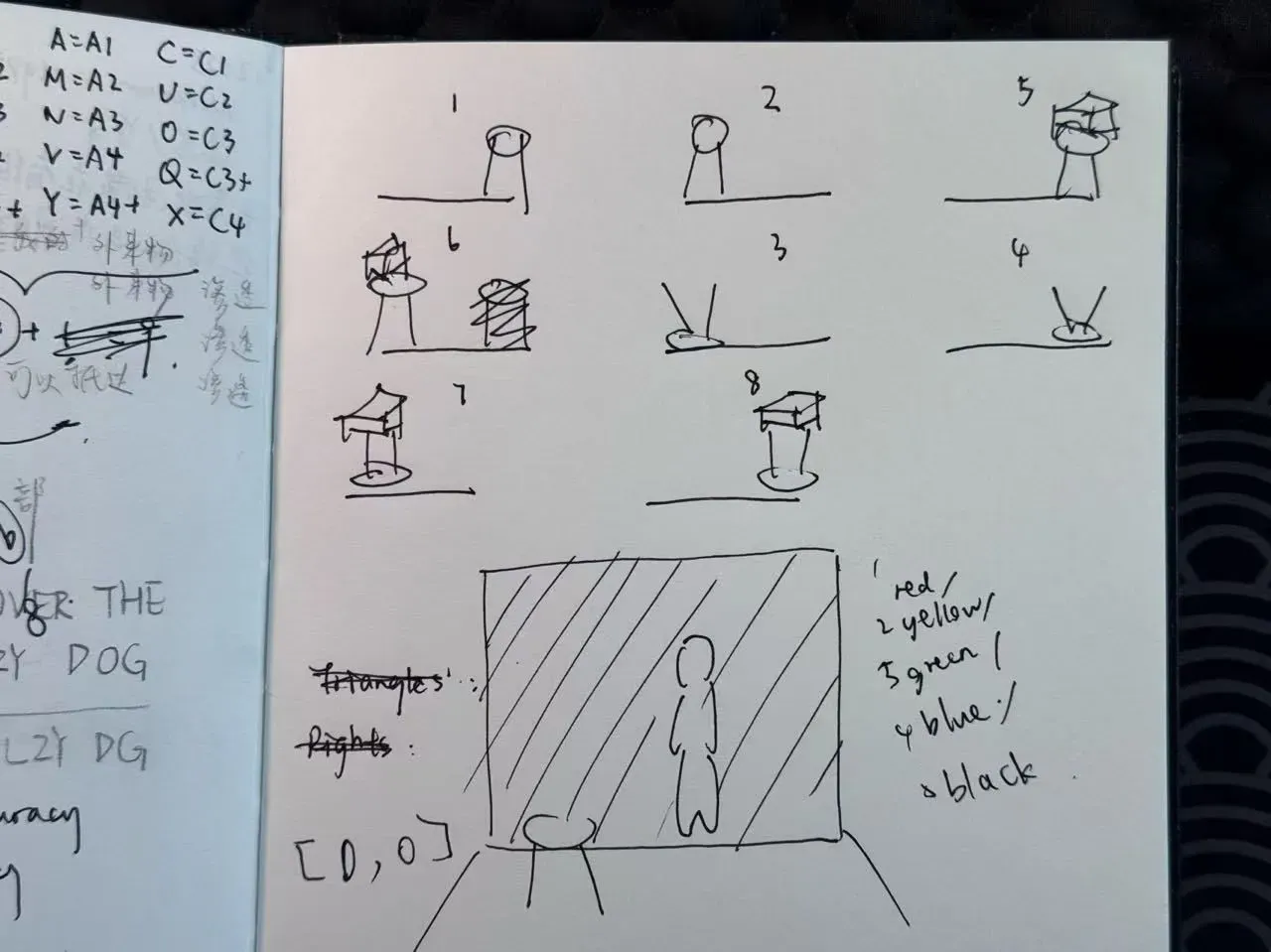
But the chair setup came with a few problems:
- To make it octal rather than just quaternary, we needed an extra layer (like whether something was placed on top of the chair). That added step slowed everything down.
- We had to find the right kind of chair—one that was stable both upright and flipped.
- And honestly, moving chairs around is heavy work. Not very practical.
So we looked for another prop. Conveniently, there was a set of boxes at home:
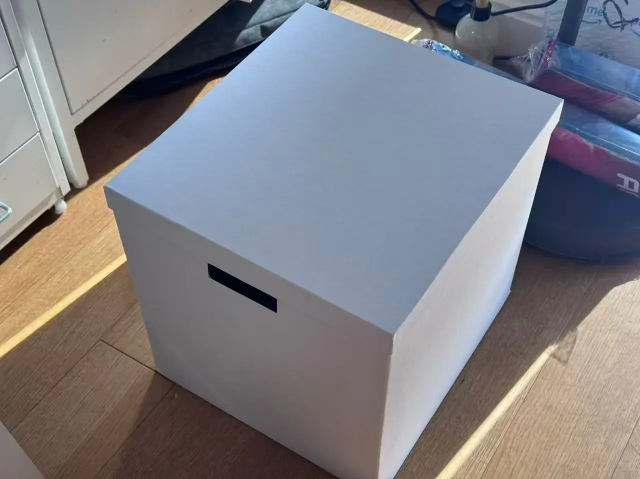
Instead of relying on spatial variations, the nice thing about boxes is that each face can carry information. And being perfect cubes, they immediately reminded us of dice:
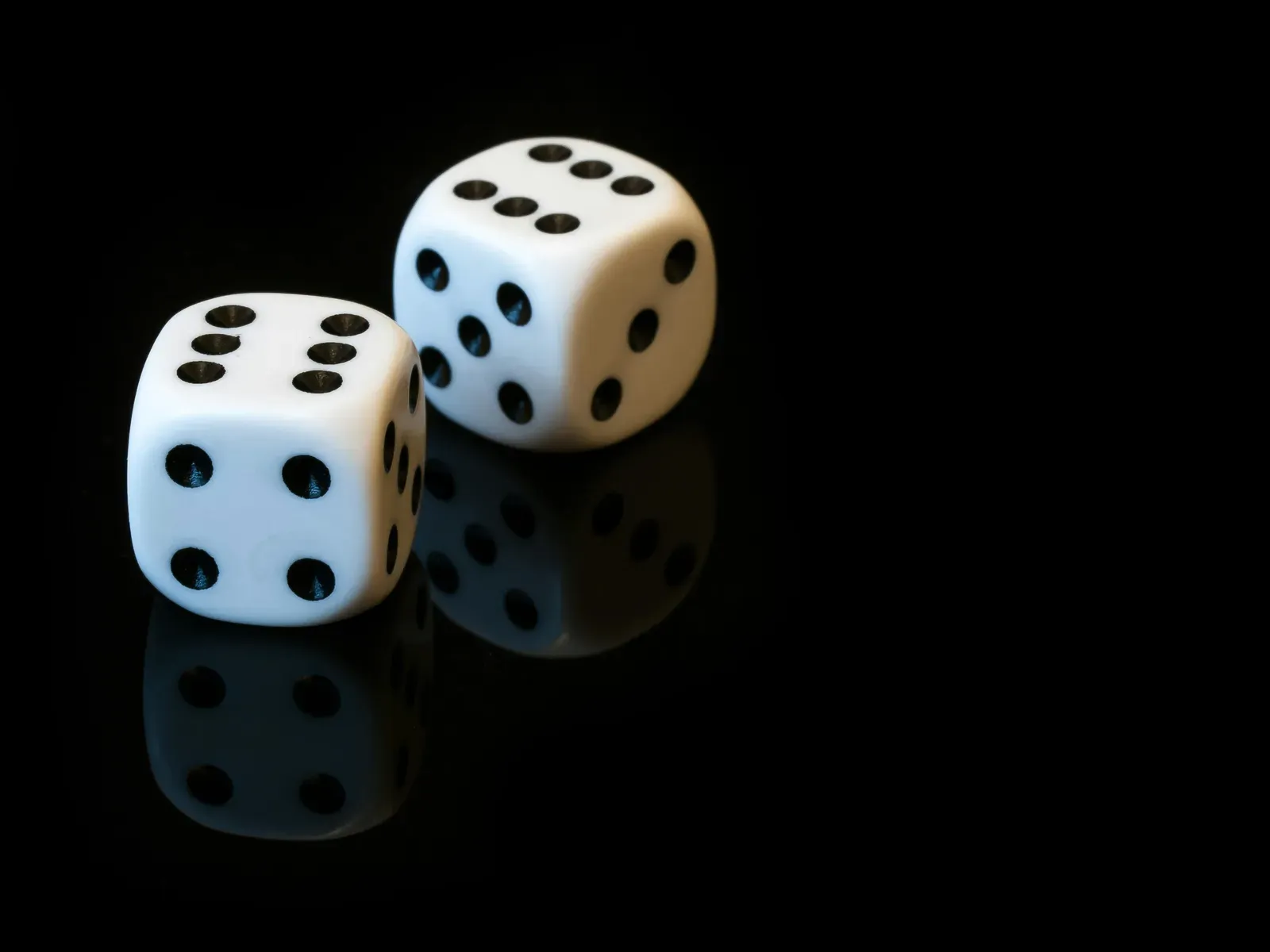
Which led us to the final plan:
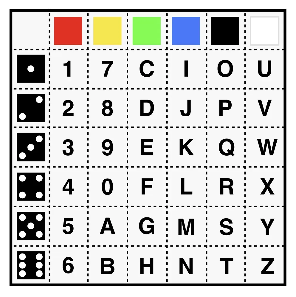
Two giant dies, one with each side painted with digits and the other pure color to communicate 6x6 = 36 types of information, which also fits all the alphabets + numbers from 0-9.
| Red | Yellow | Green | Cyan | Blue | Purple | |
|---|---|---|---|---|---|---|
| 1 | 1 | 7 | c | i | o | u |
| 2 | 2 | 8 | d | j | p | v |
| 3 | 3 | 9 | e | k | q | w |
| 4 | 4 | 0 | f | l | r | x |
| 5 | 5 | a | g | m | s | y |
| 6 | 6 | b | h | n | t | z |
Box Design
13.8”(length) x 12.5” (width) x 12.5” (height)
-
Actual 2D Panel size:
- 12.5” x 12.5” per face
- White on Black for contrast with the background
-
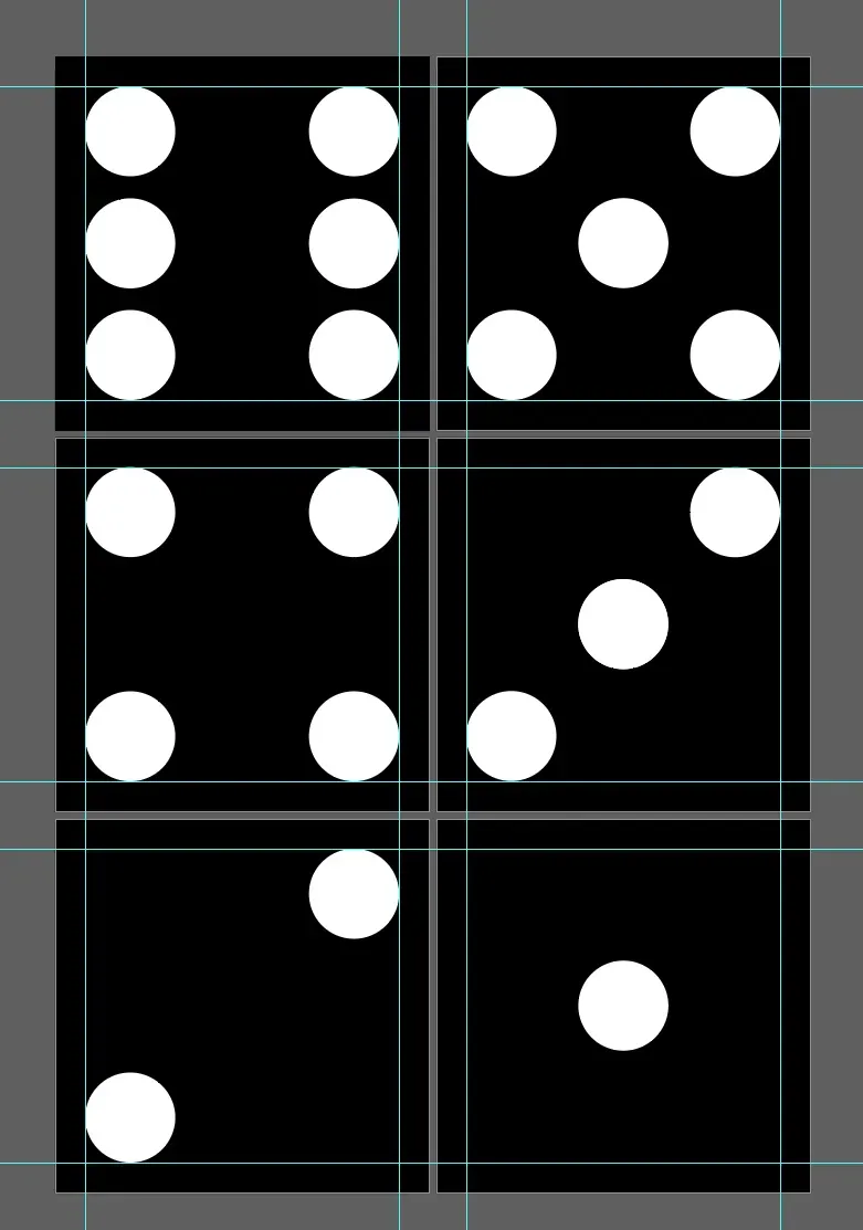
In Gestalt Theory, “the whole is greater than the um of its parts.” Our minds tend to perceive unfied, organized patterns rather than disconnected elements, so the key to our design theory is to make the big circles large enough to be visible from far away, while also spaced just far enough to be discerned as recognizable pattern.
- 1” margin on the border
- We first tested out with the pattern 6 as that was the pattern with the most circles to pack in a confined 12.5” x 12.5” grid system, and from there we tested that a cirlce with 3” diameters is the most optimal size that balances between visibility, psychological grouping, and style consistency.
- We used the existing patterns of dies with its iconic symbols for ease of communication.
-
For the color dies: six high saturation, high brightness colors that are uniquely distinguished from each other through hue
- No black and white as the perception of light and dark especially from faraway could be influenced by environmental factors like lighting
Field Testing
We first printed a batch of sample colors and set them up along both sides of the hallway for testing.
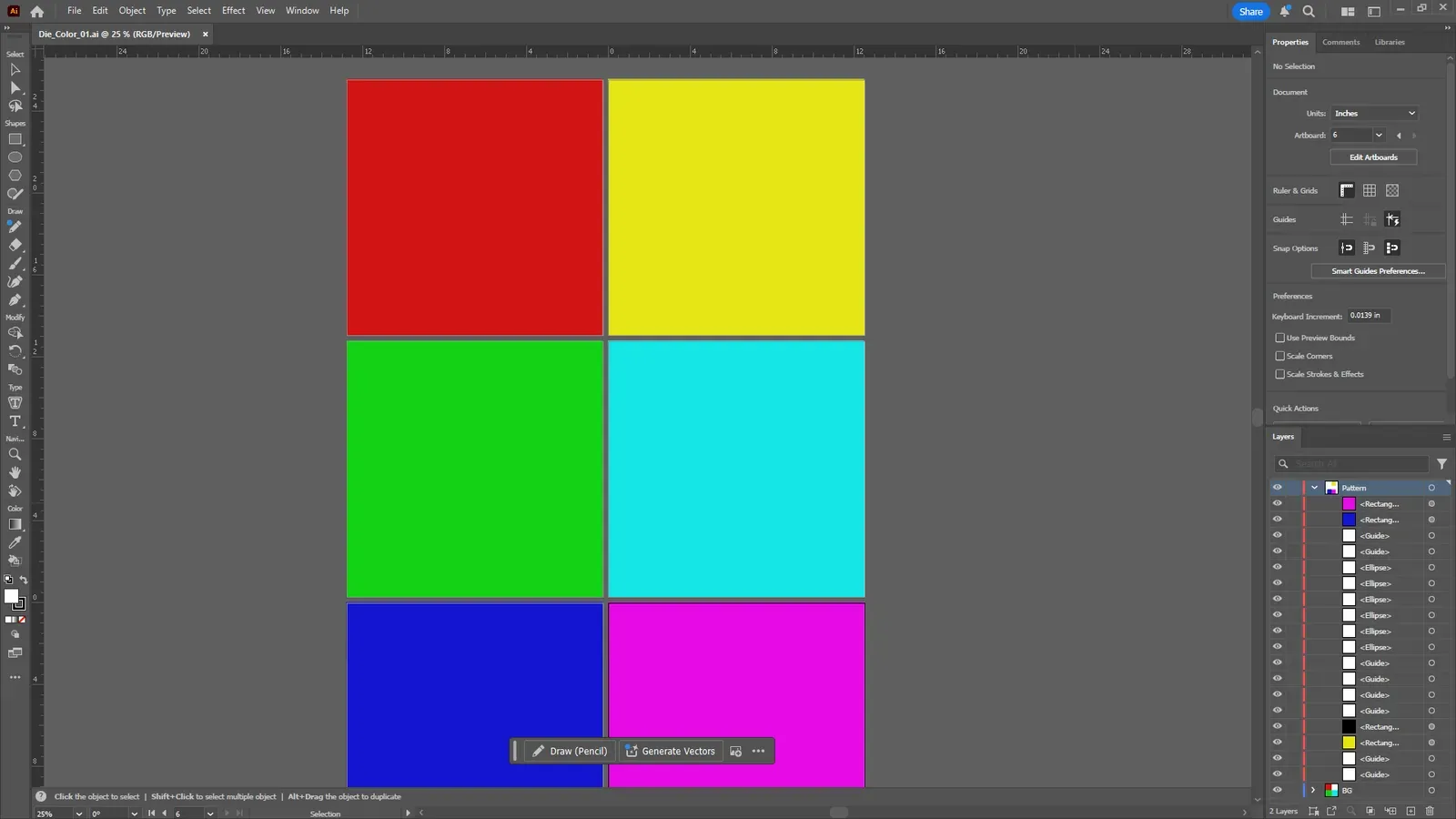
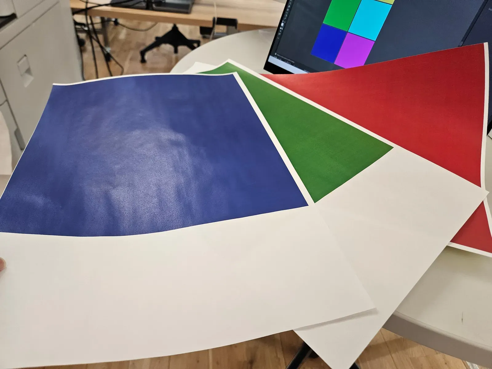
The initial accuracy was only about 60%. Purple kept getting read as magenta and mixed up with red, while dark blue was confused with green.
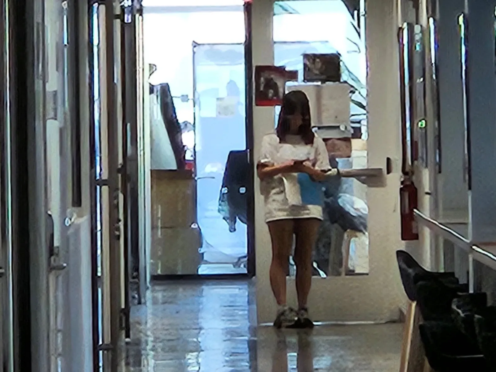
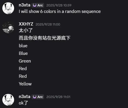
Example:
Luna read the sequence as B B G R R Y
when it was actually C B G P R Y.
So we calibrated the palette and boosted the saturation.
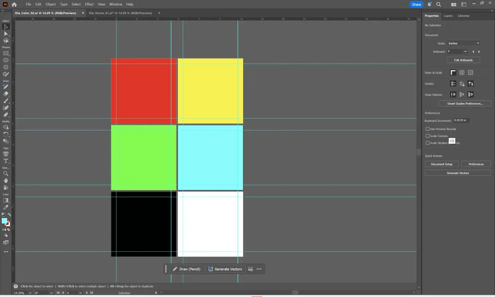
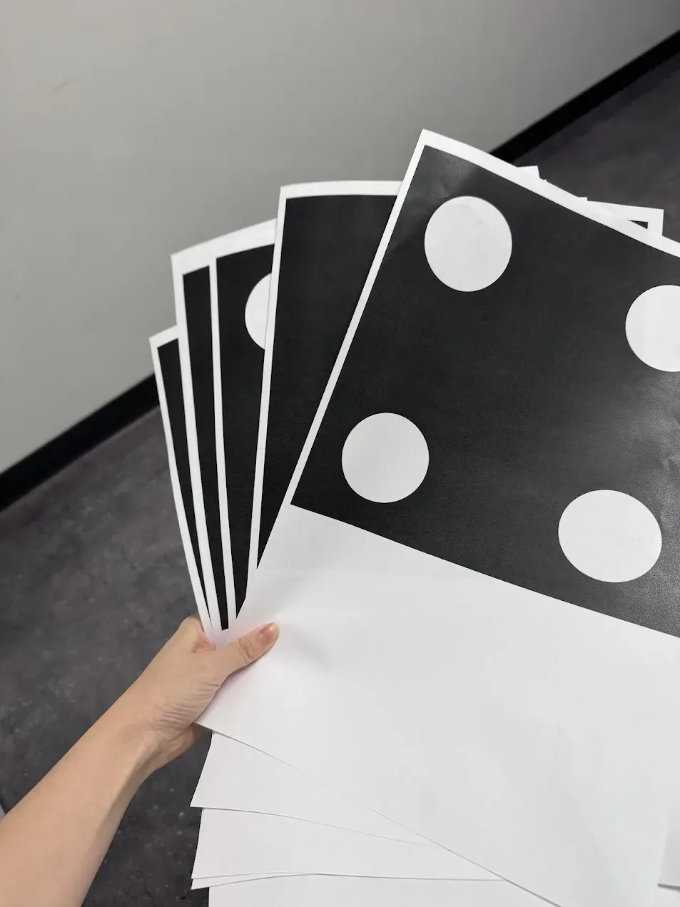
On the other hand, when we tested the numbers, the accuracy came back at 100% right away! no adjustments needed.
Final Design
This is the final reference chart after the color adjustment. We will have our own copy when we run it.
Box Signal Making
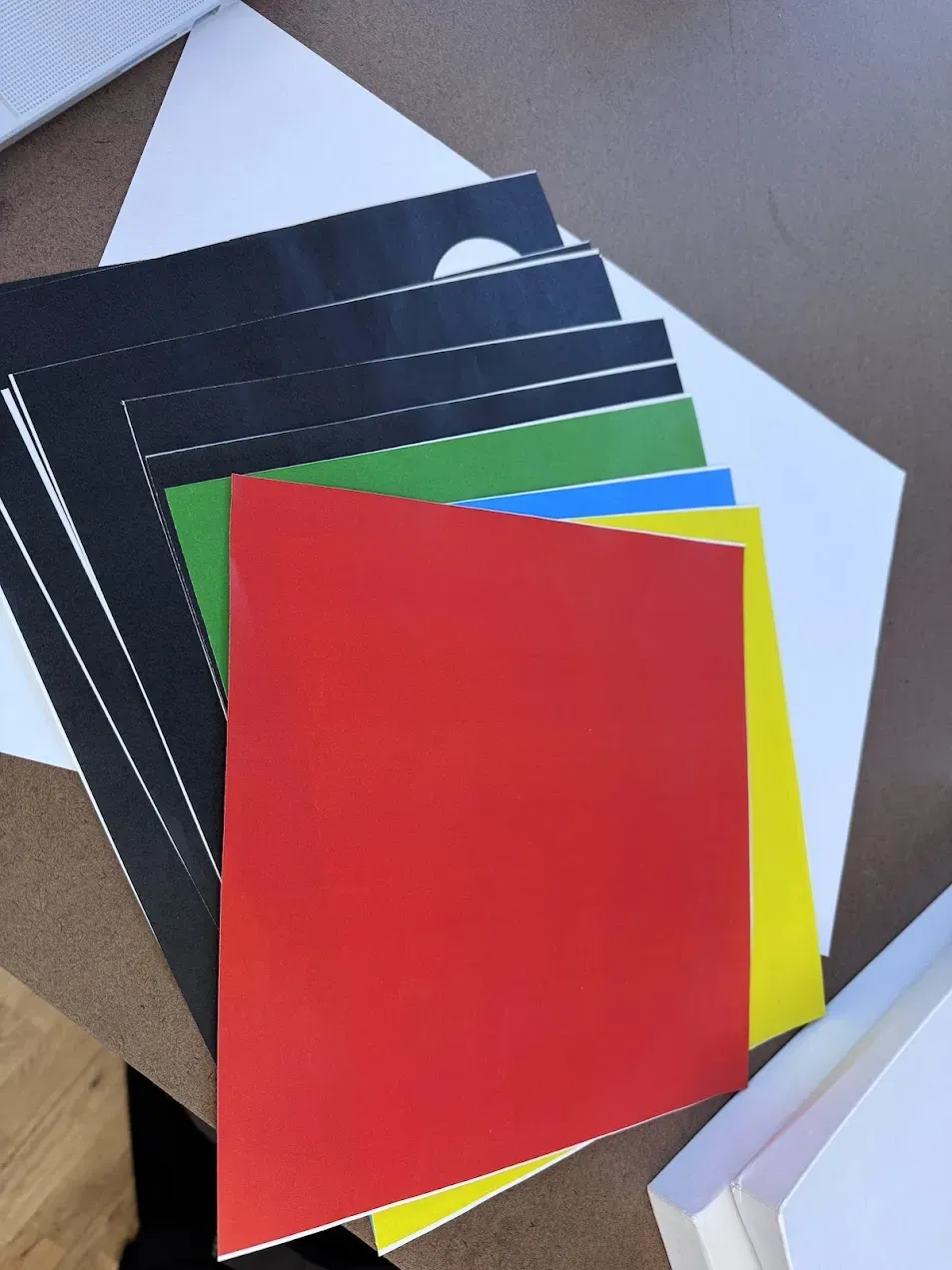
Print out the finalized materials and do a collage session. Feels nice to bring the digital logic back into something physical and shared.
进行拼贴
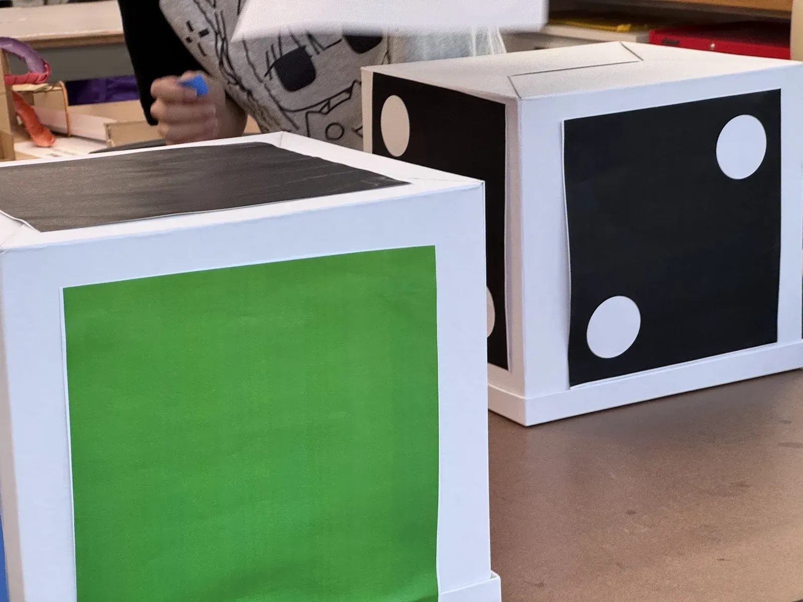
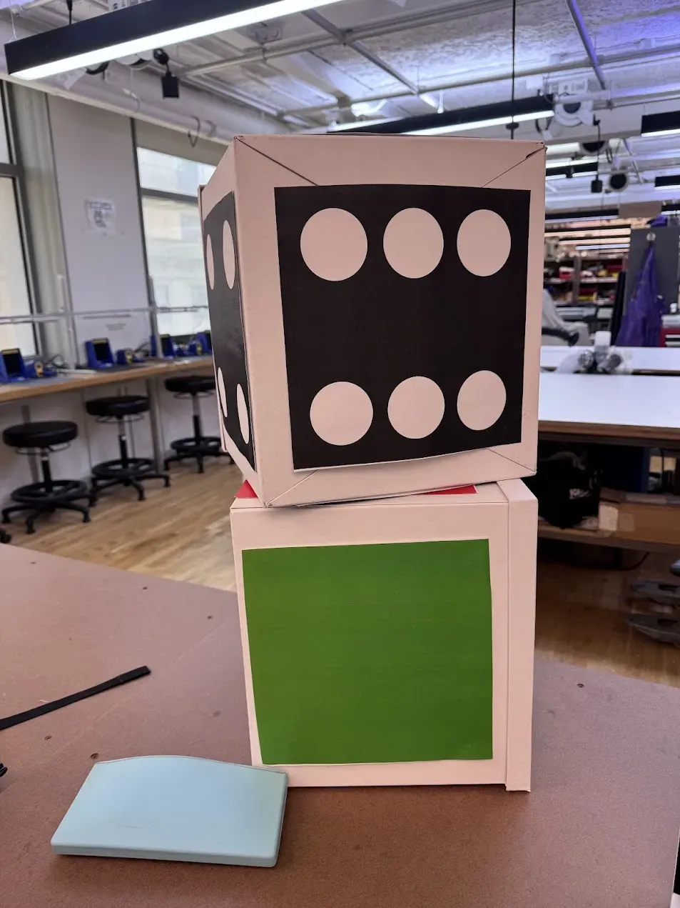
Box Testing
We ran three rounds of testing in the hallway. In the first round, Test 2, Luna misread the signal. he received a “B” but thought it was a “G.” That little slip forced us to push a quick patch: whenever he calls “Blue,” the color die goes on the left and the number die on the right; for “Green,” swap them (color on the right, number on the left.)
We also came up with a correction system:
- raising hand means “confirm” & “copy”
- using our arm to form a circle means “undo last move”
- stacking them means “end”
With that tweak in place, the second round went smoothly.
By the third round, I introduced numbers into the mix, but even then the solution came fast: CODE4LIFE.
Kind of funny how even small fixes in the protocol can keep the whole system flowing, and how quickly patterns emerge once the rules stabilize.
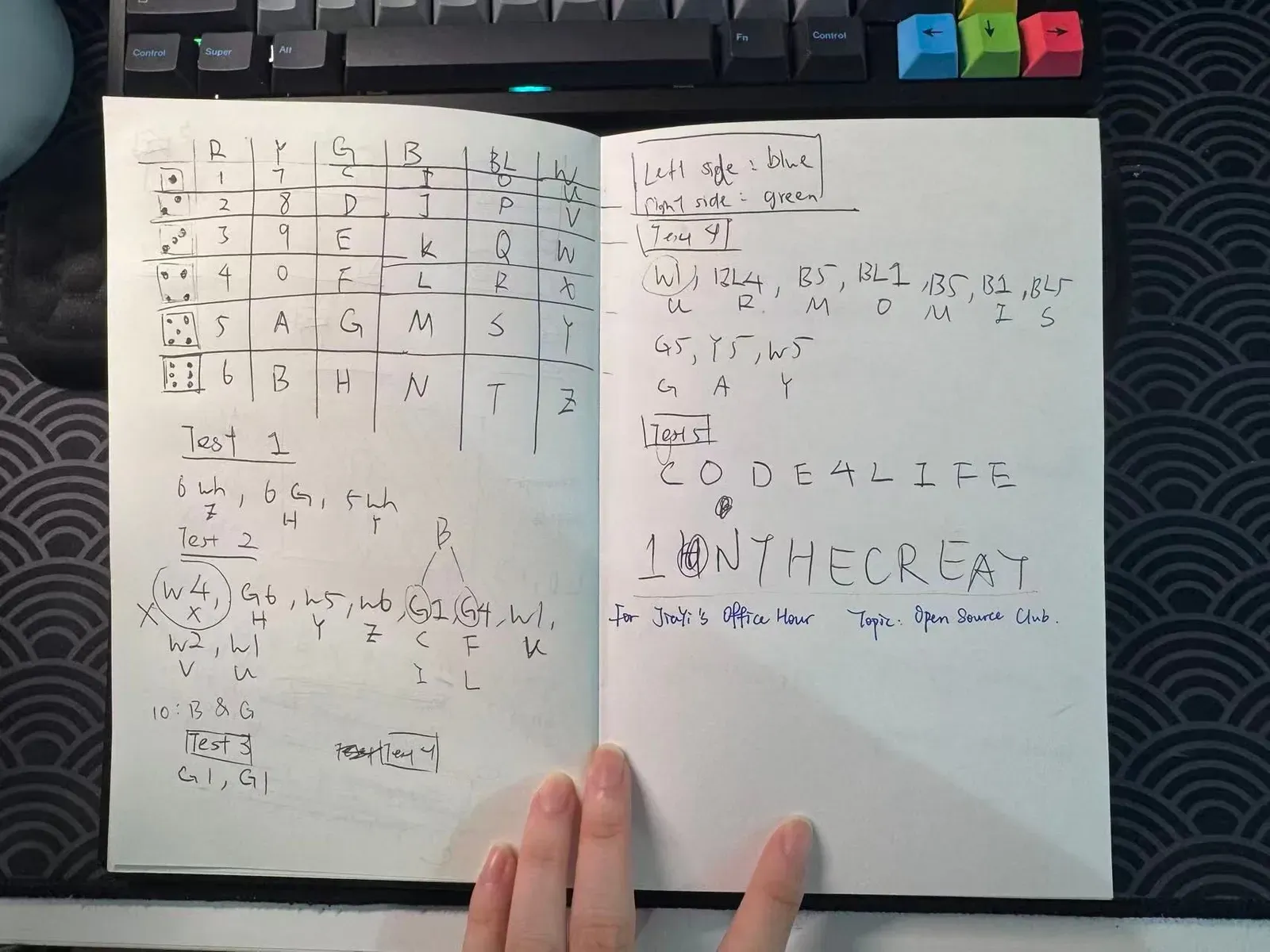
And that pretty much brought our design phase to a close. The system turned out to be convenient, easy to use, and most importantly hit a 100% accuracy rate. In my view, it checks all the boxes we set out at the start:
- reliable
- secure
- efficient
- creative